All News · Web Design
Corporate website examples: Design decisions from real projects
Feels · · 6 min read
When you look at corporate website examples, it’s easy to say “this looks nice”; the hard part is seeing why it works. We walk through the design decisions in the Demirtaş İnşaat, Seyhan Denim and Torima projects, explain the reasons behind them and give you a checklist for your own project.
Most teams planning a new corporate website start by collecting examples. That’s the right start, but examples usually pile up as screenshots and the conversation stays at the level of “we like this one’s colors, that one has a nice menu”. Yet whether a site works has less to do with how it looks than with the decisions behind it: who it was designed for, what it expects visitors to do and how easy it makes that.
In this post we look at three examples from our own projects through that lens. Our aim isn’t to make a list of “the most beautiful websites”; it’s to show what you should read when you look at an example.
How do you evaluate a good example?
When you study a website as an example, start with three questions. First: Who was this site built for? A construction company’s site may be visited by home buyers, business partners or job seekers, and each of them is looking for something different. Second: What is the visitor expected to do? Browse projects, request a quote, buy or apply. Third: How easy does the site make that step? The menu, page order, call-to-action buttons and forms are the answers to this question.
An example where you can’t answer these three questions won’t guide your own project, however impressive it looks. Once you can answer them, you’ll notice that the visual choices have a reason too.
The user’s task, by sector
Most corporate websites are made up of similar sections: about us, services or products, references, contact. What makes the difference is the order and weight given to these sections, and that depends on the visitor’s main task in the sector.
- Construction and real estate: Visitors first want to see completed and ongoing projects; trust is built through work already done.
- B2B supply and manufacturing: Buyers want to understand the product range and request a quote quickly; the catalog and the quote call to action take center stage.
- E-commerce: Users want to find a product, compare it and buy it with confidence; the category structure and checkout steps are decisive.
When choosing examples, compare sites close to your own sector with this in mind: how was the same task solved, and which one gets to the result in fewer steps?
Design decisions in real projects
Demirtaş İnşaat: a showcase that puts the projects first. In construction, trust is built through completed work. That’s why on the Demirtaş İnşaat website we brought the projects to center stage with full-screen visuals, dark tones and clear typography. We gathered the Company, Projects, Our Fields of Activity and Human Resources sections into a simple menu and presented each project on its own detail page with visuals and key facts. We kept phone, location and email visible on every page: a visitor browsing projects doesn’t have to leave the page to get in touch.
Making the site fit a growing portfolio was also a design decision. We set up a flexible content management system so the team can easily add new projects, visuals and announcements, and designed separate forms for job applications and contact requests. You can find the details on the Demirtaş İnşaat project page.
Seyhan Denim: a language that earns the trust of buyers in Europe. In B2B textiles, the first impression shapes how much buyers trust a supplier. For the site that tells buyers in Europe about Seyhan Premium Denim’s 25 years of supply experience, we built a clean interface with clear typography, navy corporate tones and strong product photography. We presented the products in an easy-to-follow catalog structure and kept the “Get a Quote” call to action visible on every page: whichever product buyers are viewing, a request is one step away.
 Seyhan Denim: catalog layout and a quote call to action visible on every page.
In this project we also built the menu around the buyer’s questions: Company, Our Products, References and Contact. The quote and contact forms collect buyer requests in one place. Details on the Seyhan Denim project page.
Torima: a discoverable catalog for a different market. Torima.ae, which we built for the Dubai market for Torima, Lenovo’s distributor in Türkiye, is an e-commerce site; but it is also a good example of how a corporate brand introduces itself in a new market. So that international users can reach products quickly and review technical specifications easily, we turned a large product catalog into a discoverable structure and simplified product comparison, category navigation and the checkout steps. The site runs on Shopify, with content and interface in Turkish, English and Arabic.
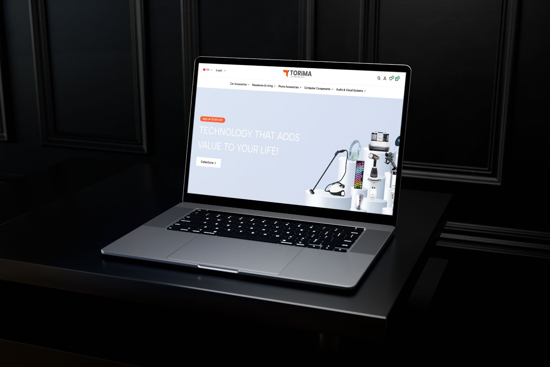 Torima.ae: product discovery and simple checkout steps for the Dubai market.
The three projects share the same principle: first we defined the visitor’s task, then we built the menu, page order and visual language to serve that task. Details on the Torima project page.
A checklist for your own project
As you evaluate the examples you’ve collected and plan your own site, answer these questions together:
- Target visitor: Who will come to your site? What is the single most important task for each of them?
- Main call to action: Is the step you expect from visitors (a quote, a call, an application, a purchase) visible on every page?
- Menu: Do the section names use internal company language, or the words visitors are looking for?
- Proof: Are your projects, products or references described in enough detail to support trust?
- Mobile: Can the menu, contact options and forms be used comfortably with one hand on a phone?
- Growth: Will it be easy for your team to add a new project, product or announcement?
If you’re planning a similar project, explore our web design service or contact us and ask us to call you.
